
Colour Drenching in 2026: The Paint Trend That Killed the Feature Wall – And What It Actually Costs
Somewhere around 2023, the feature wall stopped being a decorating decision and became an apology. One brave teal rectangle behind the sofa, four walls of magnolia hedging their bets. Estate agents loved it. Nobody living with one ever seemed to.
In This Article
- What colour drenching actually means
- Why British rooms take to it better than most
- The colours doing the heavy lifting in 2026
- The £56 question: what a full drench actually costs
- The DIY case: why drenching is easier than it looks
- Six ways a drench goes wrong
- The skirting board question
- A renter-friendly version exists
- Colour capping is coming for your ceiling next
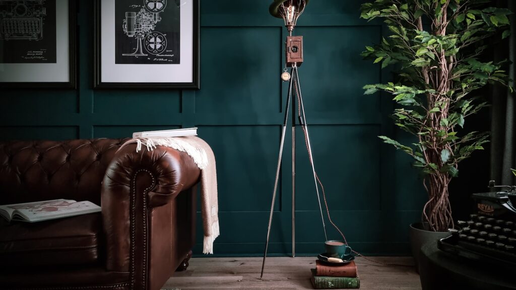
Colour drenching is what finished it off, and by 2026 it’s stopped being a designer’s party trick and become the default way Britain repaints a room. Walls, ceiling, skirting boards, the door, sometimes the radiator you swore you’d never touch – all in a single colour. Livingetc’s guide to the technique quotes a designer describing it as “a great big hug of colour”, which is a bit twee but not wrong. Done well, a drenched room feels deliberate in a way that four white walls and a cautious accent never manage.
Done badly, it feels like being sealed inside a tin of Elephant’s Breath. The gap between the two comes down to colour choice, finish, and a costing exercise most people skip until they’re standing in B&Q doing sums on their phone.
What colour drenching actually means
The rules are short. You pick one colour and you paint everything in it: walls, ceiling, woodwork, built-in cupboards if you have them. Matt or a dead-flat emulsion on the walls and ceiling, an eggshell of the same shade on skirting and doors so it survives the hoover. The finish changes; the colour doesn’t.
That’s it. No contrast lines, no white ceiling, no picture rail picked out in brilliant white gloss.
The idea isn’t new – decorators have painted panelled studies and snugs this way for decades, and Farrow & Ball has been pushing the phrase itself since the early 2020s. What’s changed is who’s doing it. Around 2022 the drenched room escaped the interior design accounts and started turning up in ordinary three-bed semis, and each year since, the paint brands have leaned harder into it because it sells them three tins where a feature wall sold one. By this year it’s the look estate agents’ photographers have quietly learned to expose for.
The effect is odd to describe and obvious the moment you see it. Because nothing interrupts the colour, your eye stops registering the edges of the room. Ceilings appear higher, boxy rooms read as calmer, and awkward features – meter cupboards, boxed-in pipework, that radiator – simply disappear into the scheme rather than demanding a decision of their own.
Why British rooms take to it better than most
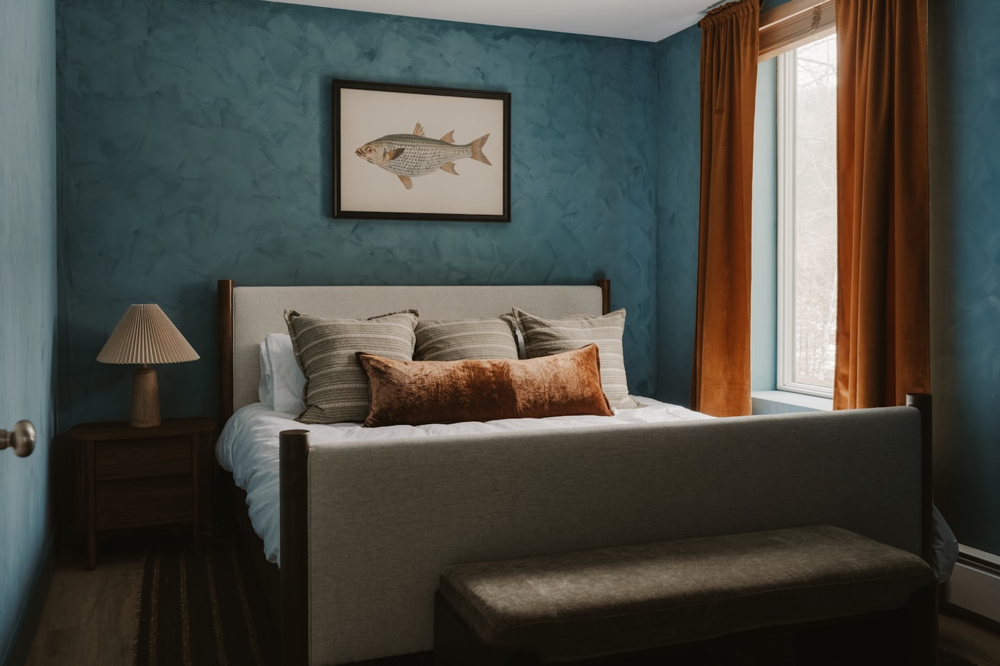
Colour drenching arrived as a designer habit, but it suits ordinary UK housing stock almost suspiciously well. The average Victorian terrace or interwar semi is full of smallish rooms with ceilings around 2.4 metres, and the standard British treatment – coloured walls, white ceiling, white trim – draws a hard line exactly where you don’t want one. That white band above your head is a constant reminder of where the room ends.
Paint the ceiling the same colour and the line goes. The room doesn’t get bigger, but it stops advertising how small it is.
The effect is strongest after dark, which matters in a country where you spend seven months of the year with the lamps on by five o’clock. Under warm artificial light, a drenched room in a deep colour turns into something close to a snug by default – the walls recede, the lamplight pools, and the television stops being the only thing worth looking at. (If the room still runs on a single ceiling pendant, the case for ditching the big light is the companion read.) White-ceilinged rooms never quite manage this; the ceiling bounces the lamp light back and flattens the whole thing out.
There’s a light argument too. Britain’s north-facing rooms get cool, flat light for most of the day, and pale walls in those conditions tend to go grey and lifeless rather than bright. A saturated drench works with the gloom instead of fighting it – which is why the technique took hold here faster than in sunnier markets, and why it shares DNA with the limewash movement that’s been working through UK homes over the past couple of years. Both trends accept that most British rooms will never be light-filled and decide to make them atmospheric instead.
And unlike some of 2026’s other revivals, the buy-in is low. A sunken living room wants a structural engineer and a five-figure sum. A drench wants a weekend, some dust sheets and a decent ladder.
The usual objection is resale. A house full of bottle-green rooms, the theory goes, frightens buyers who want a blank canvas. There’s something in that if you’re selling within the year – but it cuts both ways, because the fix is a £30 tub of white and a weekend, which is exactly what you’d say about any paint colour. Kitchens and bathrooms sell houses; the colour of the ceiling in the back bedroom doesn’t. Decorate for the years you’ll live there, not the fortnight it’s on Rightmove.
The colours doing the heavy lifting in 2026
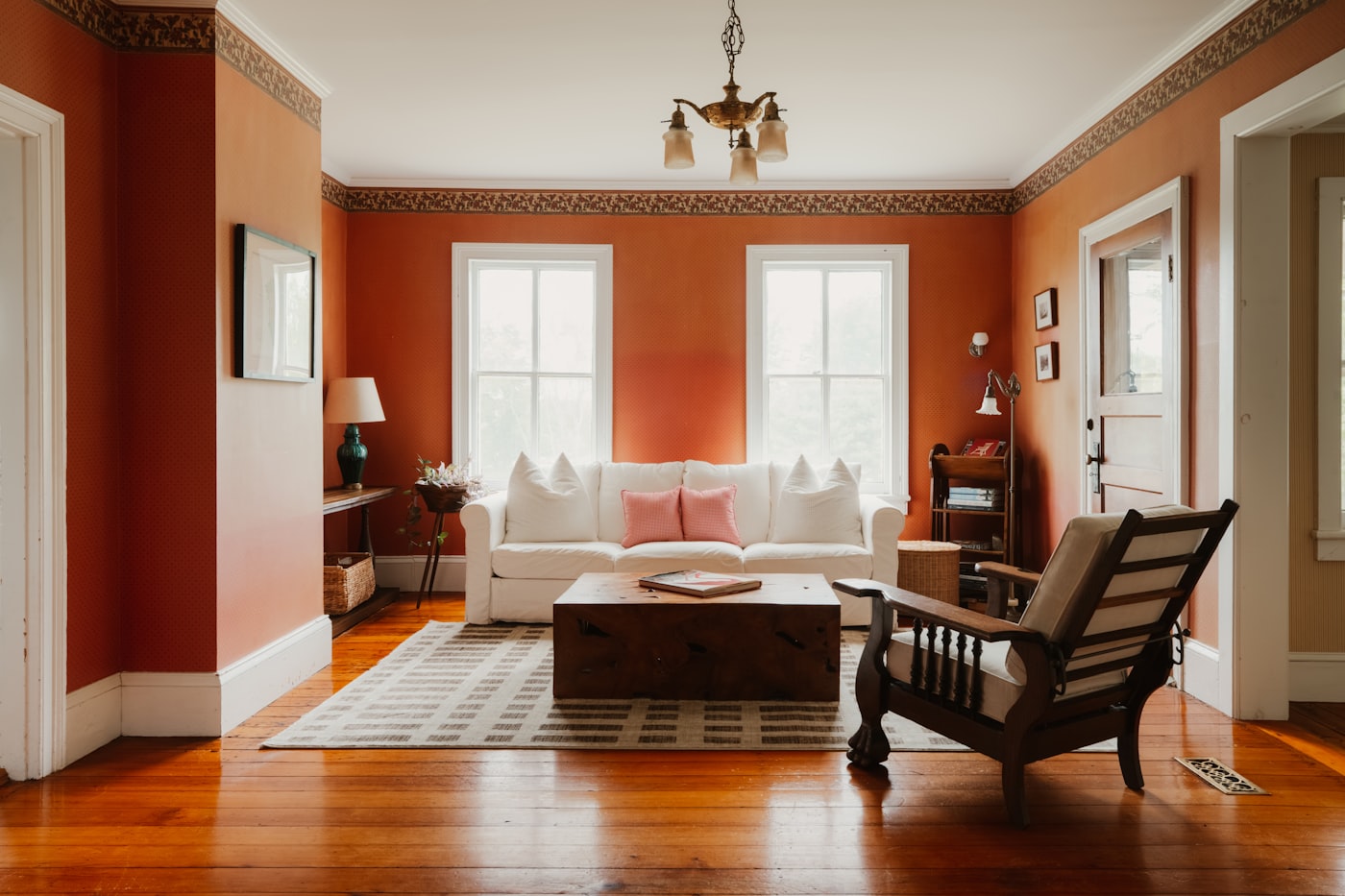
The shades Britain is drenching with this year are warmer and moodier than the ones it was painting on feature walls five years ago. Deep inky blues, olive and bottle greens, clay pinks and browns that would have seemed unsellable in 2020. Farrow & Ball’s Inchyra Blue and Green Smoke keep turning up in decorators’ order books; Dead Salmon, a shade whose name has been putting people off since the 1990s, is having an unlikely moment on entire rooms rather than the odd cupboard.
The rule of thumb decorators keep repeating: the flatter your light, the warmer your undertone. North-facing rooms want colours with red, pink or yellow in the base. Get that wrong and a fashionable green can turn swampy by mid-afternoon. Dulux’s Colour of the Year for 2027, Soulful Sage, is the textbook case – a greyed-off green that our piece follows into the north-facing rooms where it turns grey.
A practical note on matching: you don’t have to buy your emulsion and your woodwork paint from the same brand, but you do have to get them mixed to the same reference, because “nearly the same green” reads as a mistake in a way two different colours never would. Most decent paint counters will match across brands if you bring a lid or a colour code. Check the finished skirting against the wall in daylight before the second coat, not after.
One thing to resist is the cool mid-grey. Drenching a room in the greige family is the fastest way to make a 2026 technique look like a 2017 rental refurb, and grey’s retreat has been underway for years now. If you want restraint, the current answer is a chalky off-white or a warm putty drench – quieter than the deep colours, but still without the white ceiling.
Swatch big before committing. Two coats on an A2 sheet of lining paper, moved around the room for a week, will tell you more than forty sample pots. Ours lived Blu-Tacked to the landing wall for the best part of a month before we trusted a dark green, and the colour we chose wasn’t the one we started with.
The £56 question: what a full drench actually costs
Here’s where the trend gets expensive, because drenching multiplies your paint bill. A feature wall was one tin. A drench is walls, ceiling and woodwork, usually in two coats, and dark colours over pale walls can demand a third.
Take a typical UK living room of about four metres square. Walls and ceiling come to roughly 45 square metres of surface; two coats means covering that twice. In Farrow & Ball’s Estate Emulsion, at £56 for a 2.5 litre tin, you’re looking at three tins – around £168 before you’ve touched the woodwork, which needs its own eggshell at a higher price again. Call it £250 or more for one room, plus primer if you’re going dark over magnolia.
Now the contrarian bit: for a drench, Farrow & Ball is the wrong buy for most people. Its chalky depth of finish is real, but the whole premise of drenching is one continuous colour with no contrast to judge it against – the conditions under which a £38 tin looks most like a £56 one. Dulux Heritage runs £35 to £42 for the same 2.5 litres depending on retailer, matches the muted period palette almost shade for shade, and scrubs up better against small children and dogs. The same room comes in at roughly £115 to £130. Little Greene sits up at Farrow & Ball money and is lovely, but it’s answering a question drenching doesn’t ask.
If the budget is tighter still, the own-brand ranges at B&Q and Wickes will colour-match a designer shade for well under half the price. Purists wince. On a ceiling, nobody can tell.
The DIY case: why drenching is easier than it looks
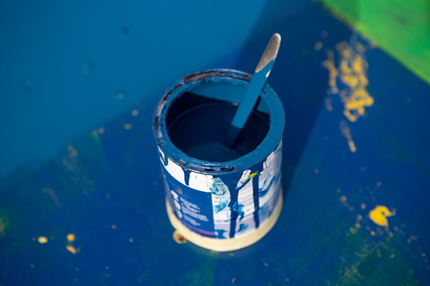
Here’s the part the intimidating Instagram photos don’t tell you: a drench is one of the more forgiving jobs an amateur decorator can take on.
Think about what actually goes wrong when you paint a room the conventional way. It’s the edges. The wobbling line where coloured wall meets white ceiling, the taping around the skirting, the steady hand needed at every junction between one colour and the next. Cutting in is the skill that separates decorators from the rest of us, and a drenched room barely asks for it. When the ceiling, the wall and the trim are all the same shade, an imperfect line between them is invisible by definition. You still need to keep paint off the windows and the floor. You don’t need to keep it off anything else.
The trade-off is volume and sequence. Ceilings are miserable to roll – there’s no version of this where your neck doesn’t ache on Sunday evening – and the order matters: ceiling first, then walls, then woodwork last in its tougher finish, with proper drying time between coats. Dark colours also show roller marks more than magnolia ever did, so cheap kit is a false saving here. A decent medium-pile roller and a £6 sleeve you throw away afterwards will do more for the finish than an extra coat.
The radiator deserves its own sentence, because it’s the bit people bottle. Standard emulsion will discolour and flake on a hot radiator; you want a specialist radiator paint or a heat-tolerant satinwood, colour-matched to the walls, applied when the heating’s been off for a day. It’s an hour of faff. It’s also the single detail that makes a drench look professional, because a white radiator on a dark green wall is the loudest object in the room.
Budget a full weekend for an average room, longer if you’re going dark over pale and need that third coat. And do the swatch-on-lining-paper test before you buy five tins, not after.
Six ways a drench goes wrong
The first mistake is stopping short. Drenched walls and ceiling with white gloss skirting isn’t a subtle version of the trend; it’s the old scheme with a painted ceiling, and the white trim reads as an error rather than a choice. If you’re not prepared to do the woodwork, don’t start.
The second is using one finish everywhere. Matt emulsion on skirting boards marks the first time a shoe touches it. You need the same colour in a tougher finish down low – eggshell, usually – or the scheme starts looking scuffed within months.
Third: forgetting texture. A room in one flat colour lives or dies on what you put in it. Wood, wool, linen, ceramics, a rug with some pile – the variation has to come from materials once it can’t come from paint. This is where the drenched room quietly justifies spending on decent homeware rather than more decoration; a velvet cushion does more work against bottle green than it ever did against white.
And fourth, drenching the wrong room. The technique flatters rooms you occupy in the evening – sitting rooms, dining rooms, bedrooms, studies. It’s less kind to the spaces where you need to see what you’re doing. A drenched kitchen photographs beautifully and then makes chopping an onion at 7am feel like a scene from a submarine film. Hallways and box rooms, on the other hand, are perfect first attempts: small commitment, big payoff, and nobody stands in a hallway long enough to tire of it.
Fifth, and this is the one that gets ignored most: bad surfaces. A contrast scheme hides a lot. When walls, ceiling and woodwork are all the same colour, every lump in the plaster, every badly filled crack and every wobbly skirting joint becomes more obvious, not less, because there’s no longer a colour change to pull the eye away from the line. Most of the work in a successful drench happens before the lid comes off the tin – filling, sanding, and caulking the gap between skirting and wall. Budget a weekend for prep in an older house, and don’t skip it because the colour’s exciting.
And sixth, drenching a layout that wasn’t built for it. The technique wants an enclosed room. Big open-plan kitchen-diners, conservatories and anything with a wall of glazing fight it: the eye is meant to travel from one zone to the next, and a single dark shade over the whole ground floor reads as a cave rather than a room. If you’ve zoned the space properly – partial walls, a screen, a step down – drenching each zone in its own shade can work well, and we get into that tension in our guide to broken-plan living. Drenching the lot in one colour usually doesn’t.
The skirting board question
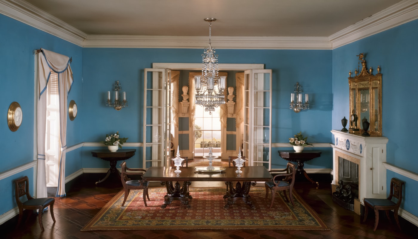
The single biggest mental hurdle British homeowners report is the skirting board. We’ve been trained since childhood that skirting boards are white, full stop. Painting them the same colour as the walls feels, briefly, wrong. Almost everyone who commits to it reports the same thing a week later: they don’t notice the skirting boards at all anymore, and the room feels taller.
That’s the whole trick. White skirting boards put a horizontal line around the room at roughly 15cm above the floor, and the brain reads that line as the bottom of the wall. Remove the line and the wall reads as taller. In rooms with low ceilings – which is to say, most rooms in most UK homes – that perceived extra height is worth more than any amount of clever furniture arrangement. And if the floor itself is the feature – the checkerboard floor revival being the obvious 2026 example – a drenched wall is the calmest backdrop you can give it.
The same logic applies to radiators. Painting a radiator the same colour as the wall behind it is the single cheapest interiors upgrade available to any UK renter or homeowner, and colour drenching effectively forces you to do it. Once you have, you won’t go back.
A renter-friendly version exists
Most colour drenching guides assume you own your home and can paint everything you like. Plenty of UK renters can’t, and the trend has adapted. Removable wallpaper in a single saturated shade, lining paper painted with a tenancy-friendly emulsion, or simply painting the walls and skirting (most landlords will accept this in writing if you agree to repaint at move-out) all get most of the way there. A handful of brands – COAT in particular – now sell sample-pot bundles specifically marketed at renters wanting to test a drench in one room before committing.
For renters who can’t paint at all, the workaround is tonal layering: floor-length curtains in a dominant shade, a large rug in the same family, upholstered furniture and large-scale art in adjacent tones. It isn’t a true drench, but it produces the same enveloping effect, and crucially it goes with you when you move.
Colour capping is coming for your ceiling next
Trends this visible don’t sit still, and the trade is already pushing the next iteration. Livingetc has been making the case for “colour capping” – keeping the drench on the walls but taking the ceiling a shade lighter or deeper from the same colour family, so the room gains a soft lid rather than a hard line. Elle Decoration is tipping it as the defining paint move of 2026, and its cousin, double drenching, layers two related tones through the same room for a slightly less absolute result.
Whether that’s a real evolution or a way to sell a second tin of paint is a fair question. Capping does solve drenching’s one genuine weakness – very dark ceilings can feel heavy in rooms with poor light – but it also reintroduces exactly the kind of decision-making the original trend was loved for removing. If it’s texture rather than colour you’re after, limewash paint is the other finish having a moment – though half of what’s sold as limewash isn’t.
The honest reading is that the single-colour room is now a permanent part of the British decorating repertoire, the way the white ceiling was for fifty years, and the variations will come and go around it. It’s also one of the cheapest high-impact changes you can make to a house – no trades, no planning, no garden room budget required.
So the question isn’t really whether colour drenching is still current. It’s which room you’d risk first – and whether you can bring yourself to run a loaded roller over a perfectly good white ceiling.