
Dulux Colour of the Year 2027 Is Soulful Sage, the Colour Britain Never Stopped Painting: What a Room Costs From £48, and Where It Turns Grey
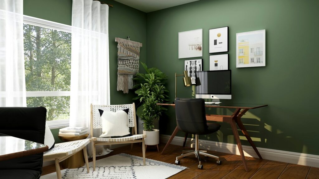
The odd thing about the Dulux Colour of the Year 2027 is that a good chunk of Britain has already painted it. Dulux announced Soulful Sage on 8 September – a soft, silvery, greyed-off green – and within a day the interiors press was doing something it almost never does with a Colour of the Year, which is admit surprise. Not at the boldness of the choice. At the safeness of it. Ideal Home’s room decor editor said she’d assumed sage was on the way out. Homes & Gardens had spent the spring writing pieces about the shades replacing it. And here it is, crowned for 2027, thirteen days ago, with three “colour stories” and a £2.90 tester.
In This Article
- A Colour of the Year that arrived five years late
- What Soulful Sage actually is (and what it isn't)
- The north-facing problem nobody at the launch mentions
- What a room costs: the £48 bedroom and the £113 one
- Where to put the Dulux Colour of the Year 2027, and the one place to leave it alone
- Everyone else went pink
- The short version
So this isn’t a forecast. It’s a ratification.
That’s not a criticism of the colour, which is lovely and which I’ve had on a spare bedroom wall since 2022 without once wanting to change it. It’s a criticism of the idea that a paint company’s annual announcement tells you where taste is going. Dulux’s own creative director, Marianne Shillingford, framed the pick around a theme called “Live Lightly”, and the research behind it (AkzoNobel’s ColourFutures programme, which pulls together designers from around the world each year) talks about information overload and a heavy-feeling world. Fine. But the honest reading of Soulful Sage is that Dulux looked at what people have been buying for six or seven years and decided to put a badge on it.
Which, for anyone actually holding a roller this autumn, is useful information. It means the colour is safe, it means every retailer will match it, and it means you don’t have to pay Dulux prices to get it. Here’s what’s worth knowing before you do.
A Colour of the Year that arrived five years late
Dulux has been here before, more or less. Tranquil Dawn, its 2020 pick, was a pale grey-green that landed just as sage kitchens were becoming the default choice in every new-build showhome from Aberdeen to Ashford. Since then the annual picks have wandered: a warm brown, a pale blue, a yellow-green, a pink, a yellow, and last year a trio of blues called Rhythm of Blues. Sage was never one of them. And yet through all of it, sage kept selling. Kitchen cabinet suppliers made it a stock colour. Dunelm and Next built whole bedding ranges around it. You couldn’t walk through a John Lewis homeware floor between 2020 and 2024 without tripping over a sage cushion.
By early 2026 the trade press had started trying to retire it. Homes & Gardens ran a piece in the spring asking what was replacing sage green kitchen cabinets, then another on the “unexpected shade” (butter yellow) replacing pale greens in designer homes. Ideal Home was pushing “peige” – a pinkish beige – as the bedroom colour of 2027. The consensus was that sage had done its time.
Then Dulux crowned it anyway.
I don’t think that’s a mistake, exactly. Colour of the Year is a commercial exercise, and the commercial logic of picking the colour people already like is unarguable. But it does mean you should read the announcement differently from the way Dulux wants you to. Soulful Sage isn’t “the new direction”. It’s the safe harbour, officially sanctioned, at exactly the moment the fashion end of the market is moving somewhere else. That can be a very good thing to know when you’re about to spend a weekend and £100 on a room.
What Soulful Sage actually is (and what it isn’t)
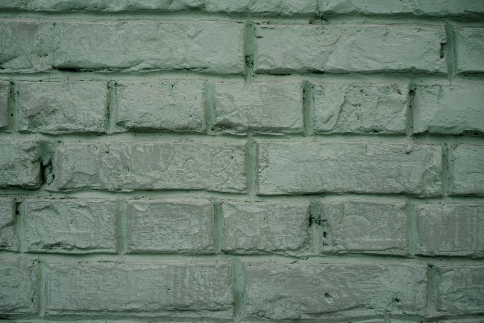
It isn’t the sage you painted your kitchen cabinets in 2021. That colour, the one that became a bit of a joke, was a mid-tone green with a fair amount of yellow in it. Soulful Sage is lighter, greyer and cooler. Dulux’s own description leans on words like silvery and ethereal, which is marketing, but the useful bit is the phrase “greyed-off green”. On a swatch it reads as a green. On a whole wall, in flat British daylight, it reads as a grey that happens to be green. That’s the point of it, and also the trap, which we’ll get to.
Dulux has built three palettes around it, which it calls colour stories. You’ll see them everywhere for the next twelve months, so it’s worth knowing which one to bother with.
Glow is the warm one: clay and terracotta tones, a chocolate brown called Belgian Chocolate, a mustardy Spiced Honey, plus a lilac (Violet Storm) that I’d leave well alone. This is the palette that makes Soulful Sage look like a considered choice rather than a default. Pair the green with a proper earthy brown on the woodwork and you’ve got something that looks like it came out of a Cotswolds farmhouse rather than a Barratt showhome. If you’ve read our piece on why chocolate brown is everywhere in 2026, the two trends meet right here.
Lift is the cheerful one: ochres, a dusty pink called Taupe Pink, a plum called Faded Damson, and a deeper green, Moss Agate. It’s good in a kid’s room or a hallway that needs waking up. The pink-and-sage combination in particular is having a moment – designers who’d have been horrified by it five years ago are now using it in country bedrooms.
Light is the one Dulux clearly expects most people to buy, and it’s the one I’d skip. Pale greys, pale blues, an off-white called Ashen White. It’s tasteful in the way a hotel corridor is tasteful. You’ll end up with a room that photographs well and feels like nothing, which is the exact problem that made everyone abandon grey in the first place.
The north-facing problem nobody at the launch mentions
Every Dulux room set for Soulful Sage is lit like a Scandinavian furniture catalogue: huge windows, low sun, white floors. That’s not your house. Most British homes have at least one room that faces north or gets its light second-hand off a neighbour’s wall, and grey-greens behave badly in them. The green drains out. What’s left is a cold, slightly institutional grey, and in a bedroom on a November morning it can look like the inside of a Portakabin.
This isn’t a Soulful Sage problem so much as a pale-green problem, but Soulful Sage is paler and greyer than the sages people are used to, so it’s more exposed to it.
The fix is boring and costs £2.90. Buy the Dulux tester (it comes with a little built-in roller now, which is a small joy), paint two patches at least A4 size on two different walls, and look at them at 8am and again at 4pm. In late September the light’s already low enough to show you what winter will do. If the patch on the wall opposite the window still looks green at 4pm, you’re fine. If it’s gone the colour of wet slate, either pick a room with better light or warm the scheme up hard with the Glow palette and change your bulbs – our piece on living room lighting for after the clocks go back covers why a 2700K bulb changes a green wall more than another coat of paint ever will.
Where it works without any of that effort: south- and west-facing rooms, kitchens with a garden door, and bedrooms you mostly see in lamplight. Ideal Home’s senior digital editor has used sage in the bedrooms of her last two houses, which tells you something about how forgiving it is once the curtains are drawn.
What a room costs: the £48 bedroom and the £113 one
Take a typical double bedroom, say 3.6 by 3.3 metres with standard 2.4-metre ceilings. Knock off the door and window and you’re at roughly 29 square metres of wall. Two coats is 58 square metres. Most decent emulsions cover somewhere between 12 and 16 square metres a litre, so you need four to five litres, which in practice means two 2.5-litre tins, and you’ll have a bit left for touch-ups.
Route one: Dulux Easycare, the washable matt. B&Q currently has 2.5-litre tins between £20 and £32 depending on the colour, and runs a mix-and-match offer of two for £48. Add the £2.90 tester and a roller set from the same aisle and you’re painting a bedroom for about £60 all in. Soulful Sage isn’t one of Easycare’s 61 off-the-shelf shades, so you’ll be having it mixed at the counter, which takes ten minutes and costs nothing extra.
Route two: Farrow & Ball. Estate Emulsion in 2.5 litres is from £56.43 at trade suppliers like Paint Direct, and a bit more in the F&B shop itself. Two tins, £113. You’d be buying a near-match rather than Soulful Sage itself, but F&B’s greys and greens sit in exactly the same territory, and plenty of people will do this because the tin looks nicer on the shelf in the utility room.
Is the F&B tin twice as good? No. Which? tested twelve washable matt emulsions in January 2026 – Dulux Easycare, Crown Easyclean, GoodHome from B&Q, Johnstone’s, Lick, Farrow & Ball’s Modern Emulsion, Wickes and others – scrubbing crayon, chocolate and permanent marker off each one. The full scores are behind the Which? paywall, but two things it says openly are worth repeating: the worst paints washed straight back to the undercoat, and its Great Value pick cost under £20 for 2.5 litres, less than half the price of many tins on test. Price and performance don’t track neatly in paint. They never have.
One more route, if you’re feeling frugal: B&Q’s own GoodHome range will colour-match anything you hand them, including a Dulux swatch card, and it was in that Which? line-up. My neighbour did her whole downstairs in matched GoodHome last spring for the cost of two F&B tins and I couldn’t tell you which wall was which.
Where to put the Dulux Colour of the Year 2027, and the one place to leave it alone
Walls. Ceilings too, if you’re brave. Soulful Sage is at its best as a wraparound – the whole room, woodwork included, the way Dulux shows it in its living room set. A pale grey-green on every surface stops reading as “a green room” and starts reading as light, which is the effect Dulux is going for and one it does actually achieve. We covered the technique in our piece on colour drenching earlier this year, and this is the first Colour of the Year I’d say suits it without reservation. Dulux has even coined a variant, “Double Drench”, which is two related greens on different planes of the room. It looks better than it sounds.
Bedrooms, obviously. Home offices, where the calm-and-concentration argument has at least some evidence behind it and where the split-wall idea (Soulful Sage below, a warm off-white above) works on a budget. Kitchens, but on the walls, framing an arch or a shelf run, the way Dulux shows it.
Not the cabinets.
Painting kitchen cupboards sage green in late 2026 is the surest way to date a kitchen to 2021 that I can think of. It’s the one application where the trade press’s “what’s replacing sage” pieces were right. If your cabinets are already sage, leave them and repaint the walls – Soulful Sage on the walls next to a deeper sage cupboard is more or less the Double Drench idea and it’ll refresh the room for £60. If they’re not, pick something else for the doors. A deep brown, a dirty plum, even the butter yellow everyone’s excited about, though I’d want to see that one in February before committing.
Bathrooms are a maybe. Colour is going back into British bathrooms after a decade of white tiles, and a soft green against timber and brass is a good look. But most bathrooms are small and many are windowless, and that’s the north-facing problem all over again.

Everyone else went pink
Context matters here, because Dulux isn’t the only brand handing out a colour for 2027 and the others have gone in a different direction. Graham & Brown announced Rose Earth, a dusty, muddy pink, the week before Dulux. In the US, Sherwin-Williams picked Celery, a yellower green that’s deliberately not sage, and Behr went with a colour called Grounded. Pantone’s 2026 pick was an off-white called Cloud Dancer, and its 2027 announcement is due in December. Little Greene, meanwhile, launched 26 new shades this year, several of them murky historic pinks and blues that have nothing to do with sage at all.
Read together, the picture is fairly clear. The fashion-led end of the market is moving into earth tones, pinks and deeper, moodier colours. Dulux, which sells more paint in Britain than anyone, has picked the quiet backdrop those colours sit against. Both things can be true at once. And if you’re the sort of person who paints a room every few years rather than every season, the backdrop is the sensible thing to buy, because it’s the bit you won’t want to change.
It also explains why sage keeps surviving the trend cycle. It’s a neutral that isn’t grey or beige. That’s a small category and there aren’t many other colours in it. Britain’s return to wallpaper is partly a reaction against flat neutral walls, and yet the walls people are papering against are, very often, sage.
The short version
Buy the £2.90 tester before anything else and put it on the darkest wall in the house. If it holds its green at teatime, you’ve got a colour that’ll outlast whatever Pantone announces in December. Get it mixed in Dulux Easycare or a matched GoodHome for about £48 a room, put the saving towards a decent brown or terracotta for the woodwork from the Glow palette, and leave the kitchen cupboards alone.
And if you already have a sage room, you’re not behind the trend or ahead of it. You’re just where Dulux has decided everyone else should be. Whether that makes you feel vindicated or slightly annoyed probably tells you which of the three colour stories you’ll end up buying.
Would you paint a room the Colour of the Year, or does the badge put you off?
Sources: Dulux Colour of the Year 2027; Dezeen, 8 September 2026; Ideal Home, 9 September 2026; Homes & Gardens; Which? washable paint tests, January 2026. Prices checked 21 September 2026 and may have changed.