
Chocolate Brown Interiors Are Everywhere In 2026 – Where The Trend Works, And Where It Falls Flat
Searches for chocolate brown interiors are up around 120% on last year, and you can see the proof in every other room on your feed: cocoa walls, a mushroom-coloured sofa, a bar cart in burnt umber. Grey has been shown the door. After roughly a decade of cool, flat, faintly clinical rooms, Britain has decided it wants to feel warm again, and brown is doing most of the heavy lifting.
In This Article
- What chocolate brown interiors actually mean in 2026
- The paint shortlist worth a tester pot
- The rooms where it sings, and the one where it sulks
- Pairings that stop it looking like an old pub
- It’s the texture that sells it, not just the colour
- Easing into it without repainting the whole house
- The mistakes already showing up
- Worth doing, or just the next thing you’ll paint over?
It’s a hard colour to get right, though.
Get it wrong and you’ve recreated a 1974 living room – teak veneer, swirly carpet, the lot. Get it right and the room reads like a good leather jacket: rich, lived-in, expensive without shouting about it. The gap between those two outcomes is narrower than the glossy trend round-ups let on, and that’s really what this piece is about. Not whether chocolate brown is in – it plainly is – but where it actually earns its place, and where you’d be better off leaving the tin in the shed.
What chocolate brown interiors actually mean in 2026
The version of brown doing the rounds this year isn’t the flat, muddy 70s shade your nan had on the hallway woodchip. It’s warmer and more complex, closer to cocoa, espresso or dark chestnut, with a bit of red or purple buried in it depending on the light.
The shift everyone in the trade keeps pointing to is the move away from cool, grey-leaning colours towards warm ones with depth. Benjamin Moore made it official by naming Silhouette, a sort of espresso-meets-charcoal, as its colour of the year for 2026. Designers up and down the country have followed the same instinct. A panel of Yorkshire interior designers recently put chocolate brown at the centre of the looks shaping British homes this year, which tells you it isn’t just a London thing.
What’s changed since 2024 is how it’s used. Two years ago people went all in on one tonal story – chocolate walls, mocha sofa, mushroom curtains, the room basically dissolving into one big cup of coffee. That looks heavy now. The 2026 approach treats cocoa as a grounded base instead, a backdrop that lets a stronger accent colour come forward. It’s the difference between a brown room and a room that happens to use brown well.
The paint shortlist worth a tester pot
You don’t need forty options here. A handful of browns keep coming up because they actually behave on a wall, and most of the rest are variations on them.
Farrow & Ball’s London Clay is the safe starting point – a warm, slightly pinkish brown that doesn’t go cold when the sun drops. Salon Drab is darker and a touch greener, better for a snug or a small study where you want the walls to recede. If you want the proper espresso end, Benjamin Moore’s Silhouette is the one the magazines keep photographing, though you’ll need a stockist or a colour match to get it here.
And this is where I’ll save you some money. The tester pots are about seven quid each at Farrow & Ball, which is fine for two or three. But once you’ve settled on a shade, get it colour-matched at B&Q or Homebase in their own trade emulsion. The finish on a feature wall is close enough that nobody who isn’t a decorator will ever clock the difference, and you’re paying maybe a third of the price for the big tins. I’ve done exactly this in a hallway and not lost a wink of sleep over it.
One honest caveat on finish: skip the dead-flat chalky matt for anything below waist height in a busy house. It marks if you so much as look at it, and brown shows every scuff worse than a pale colour does. A modern matt or eggshell wipes clean and still reads soft.
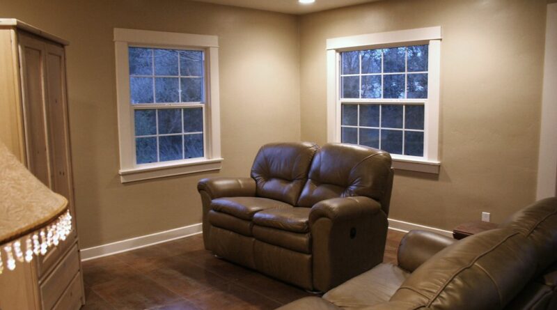
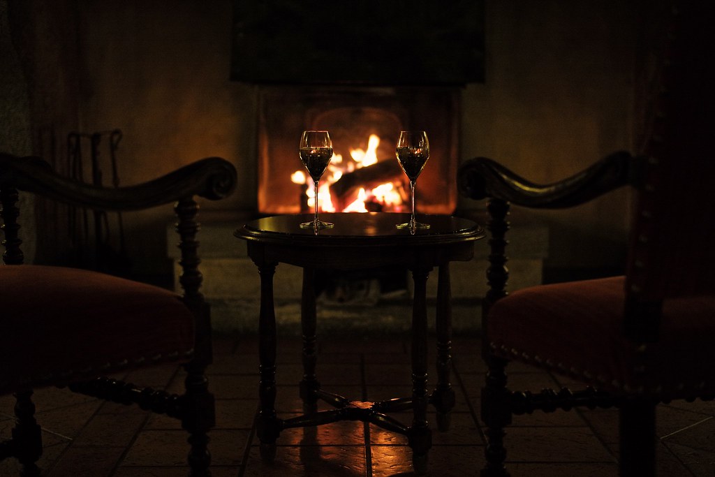
The rooms where it sings, and the one where it sulks
Brown rewards rooms you want to feel enclosed and a bit moody. A snug, a dining room you mostly use after dark, a hallway, a bedroom you treat as a retreat – all of these take a deep cocoa beautifully, because you’re leaning into the cosiness rather than fighting it. North-facing rooms can work too, as long as you accept the colour will read darker and lean into it instead of expecting brightness.
Here’s the contrarian bit. Everyone tells you brown “makes a small room feel cocooning”. Sometimes. But a north-facing box room with one mean little window and no decent lighting? Don’t bother. You’ll spend the next two years in a space that feels like a broom cupboard at 4pm in January, and no amount of brass picture lights will rescue it. That’s not the colour’s fault, it’s the lack of light, and a warm off-white would serve you far better. Save the chocolate for a room that has something to give back.
Kitchens are the interesting middle ground. Brown cabinetry, especially in a warm wood tone, looks genuinely current and ages better than the dark green everyone rushed into a couple of years back. But a fully brown kitchen with brown walls and brown units is a lot. Pick one to commit to.
Pairings that stop it looking like an old pub
This is the part people skip, then wonder why their cocoa lounge looks like a Wetherspoons carvery. Brown on its own is heavy. It needs one colour with a bit of life in it to lift the whole thing.
The pairing of the moment is cocoa with indigo. It’s not a coincidence – while the brown brands were going dark and warm, Dulux named a trio of blues called Rhythm of Blues as its 2026 colour of the year, and the two trends slot together almost too neatly. A deep indigo sofa or a pair of velvet chairs against a chocolate wall looks expensive in a way that’s hard to fake.
If blue isn’t your thing, warm metallics do similar work. Antique brass, aged gold, a bit of caramel leather. Terracotta and rust pick up the red hiding inside the brown and warm everything further. And cream – proper cream, not brilliant white – softens the edges where a stark white would just look like a mistake.
The one combination to retire: chocolate brown with cool grey. They fight. The grey makes the brown look dirty and the brown makes the grey look cheap. If you’ve still got a grey carpet down, that’s the thing to plan around before you pick up a brush. The colours interiors experts say are on the way out for 2026 are almost all the cold ones, and there’s a reason.
It’s the texture that sells it, not just the colour
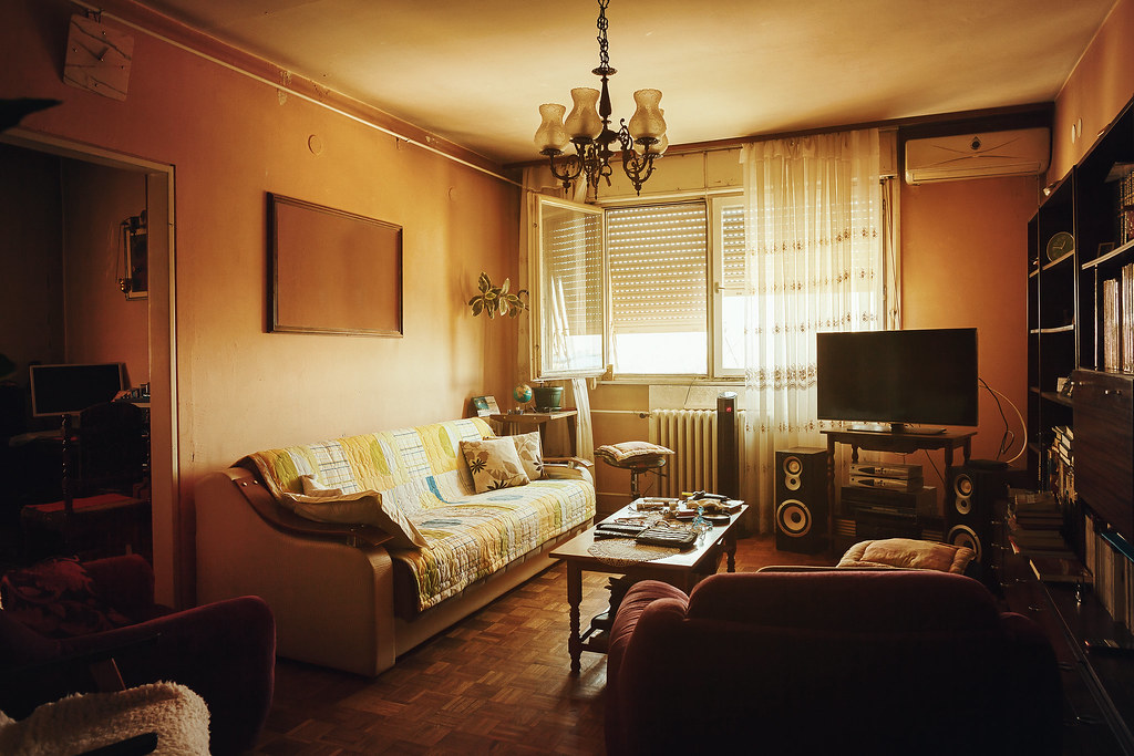
Here’s something the before-and-after shots undersell. Chocolate brown does most of its work through material, not paint. The exact same shade reads completely differently across a chalky wall, a slab of walnut, a tan leather chair and a length of coffee-coloured velvet, and that variety is the whole point. A room painted brown and then furnished in flat, samey textures looks like a swatch. A room that layers a few brown materials at different sheens looks like money.
Leather is the obvious one, and worth being fussy about. Real tan or oxblood leather only gets better as it scuffs and softens – that patina is the look people are actually chasing. The faux-leather brown sofas flooding the budget end right now do the opposite. They crack at the seams within a couple of years and never develop any character, just wear. If leather’s the plan, buy real and buy secondhand if the new price stings, or skip it entirely and go for a deep brown wool or boucle instead. A caramel boucle armchair has been the single most-photographed piece of furniture of the past eighteen months for a reason.
Wood is the quiet hero. Walnut, oak, teak, even a humble pine that’s been oiled rather than painted – natural timber brings warm brown into a scheme with grain and depth that paint can’t touch. Mix the tones rather than matching them. A walnut sideboard, an oak floor and a rattan light shade in the same room read as collected and warm, where four pieces of identical dark-stained furniture read as a showroom nobody actually lives in.
Easing into it without repainting the whole house
Most people don’t need to commit to four walls of espresso to get the look, and frankly shouldn’t on the first go.
Start with the things you can undo. A chocolate throw and a couple of rust cushions on an existing sofa. Heavy curtains in a warm brown, which do more for a room than people expect and quietly help with the heat too. A single painted alcove or chimney breast rather than the whole room – it’s an afternoon’s work and you can paint over it if you hate it. Plenty of the better British homeware brands have leaned hard into warm browns this season, so the accent pieces are easy to find without trekking round endless shops.
Wood does a lot of this work for free, by the way. A secondhand teak sideboard or an oak dining table brings warm brown into a room without a drop of paint, and it usually costs less than a new flat-pack equivalent. The Facebook Marketplace mid-century stuff that was everywhere five years ago suddenly looks bang on trend again.
The mistakes already showing up
You can spot the rushed versions of this trend a mile off, and they tend to make the same few errors.
Brilliant white woodwork against a dark brown wall is the big one. That hard white line round the skirting and door frames cuts the cosiness dead. Painting the trim the same colour as the wall, or a close warm off-white, is the single change that makes a brown room look designed rather than half-finished.
Then there’s lighting. A deep brown room under one bright ceiling pendant looks flat and a bit grim. This trend lives or dies on lamps – table lamps, wall lights, something at eye level throwing a warm pool of light. It’s no accident that the “no big light” habit took hold at the same time as all these darker colours. The two go hand in hand. If you’re after the soft, chalky depth that makes brown sit well, a finish like limewash gets you there in a way flat emulsion can’t.
The last one is seasonal, and easy to forget in June. Dark walls and heavy curtains soak up heat, and a chocolate-painted south-facing bedroom can turn into a sweatbox during a hot spell. If your house already struggles to stay cool in a heatwave, think twice about going dark in the rooms that catch the afternoon sun, or at least keep the window dressing lighter.
Worth doing, or just the next thing you’ll paint over?
Fair question, especially if you lived through the grey years, the millennial-pink moment and the rush to sage-green kitchens before that. Trends turn over fast, and dark, committed colours are the ones people tire of first.
Two practical things worth weighing before you commit. Cost first: doing a single room yourself runs to maybe £80 to £150 once you’ve bought decent paint, rollers, dust sheets and filler, assuming you’re not also patching plaster. Get a decorator in and you’re closer to £350 to £600 a room depending on where you live and how fussy the woodwork is. Brown isn’t more expensive to apply than any other colour, but the darker shades usually need an extra coat to look even, so factor that in.
Then resale, which is where I’d actually pump the brakes. If you’re planning to sell inside the next year, hold off on painting the main rooms espresso. Estate agents still push pale, neutral spaces because they photograph bigger and let buyers imagine their own stuff in there, and a heavily themed dark room can count against you on a quick sale. If you’re staying put, ignore all of that and paint for yourself rather than some hypothetical future buyer who might not even materialise. A home you actually like beats a home staged for a viewing that’s years off.
For everyone in between, the sensible move is the accent-first route earlier in this piece. You get most of the warmth, you spend a fraction of the money, and you’re not staring down a weekend with a roller and a sore neck if the mood passes.
Brown will date eventually, the same as grey did. Everything does. But it’s a more forgiving colour to live with than the cool palette it’s replacing, and the warm-wood, secondhand-furniture side of it has staying power even after the paint trend cools off. The real question isn’t whether to try it. It’s which one room in your house actually deserves to go dark first – and which one you’ve been about to ruin.
Brown pairs well with the other retro revival doing the rounds: the sunken conversation pit, back in 2026 whether your floor joists like it or not.