
Interior Design Trends 2027: 18 Colours of the Year Point to Brown, Pantone Is Still to Speak – and Why Your Grey Sofa Can Stay
Eighteen paint companies and forecasters have now named a colour of the year for 2027, and seven of them picked something that looks like soil. That’s the headline for interior design trends 2027 before Pantone has said a word: the industry has quietly agreed that the next few years belong to brown, moss and clay, and that the cool grey which carried British living rooms through the 2010s is finished. I’m not convinced you need to act on all of it. But the agreement itself is unusual, and it tells you a lot about what will be on the shelves at B&Q and Dunelm by spring.
In This Article
- What the 2027 colours of the year actually say
- Interior design trends 2027 start with brown – but not the brown you remember
- Green won the vote before Pantone even counted it
- The 2027 trends I'd actually spend money on
- Colour drenching is the one I'd skip
- What a 2027 refresh costs, from tester pot to a full room
- Why your grey sofa can stay
The tally comes from ColorCombinations’ running tracker of 2027 picks, which counted seven earth tones, four greens, four blues, two pinks or mauves and one black as of 18 November. Pantone is expected to reveal its choice at the start of December. The rest of the industry hasn’t waited.
What the 2027 colours of the year actually say
Read the list in order and you can watch the mood shift over the late summer. Valspar went first in early August with Cottage Door, a greyed mid-blue. Then the browns arrived in a rush: Dutch Boy’s Deep Rooted (an earthy orange), Behr’s Grounded (olive with brown underneath), PPG’s Country Soil, Dunn-Edwards’ French Press Coffee and, closer to home, Little Greene’s Marle, a mid-tone brown announced on 12 October.
The British picks are worth separating out, because they’re the ones you’ll actually find in a shop here. Dulux went with Soulful Sage, a soft silvery grey-green that we covered when it launched in September. Graham & Brown chose Rose Earth, a dusty pink with clay in it. And Little Greene’s Marle is the most honest of the lot – it’s just brown, and doesn’t pretend otherwise.
Sherwin-Williams picked Celery. Benjamin Moore picked Webster Green, a deep historic green. Rust-Oleum chose Mauve Classic, a smoky grey-mauve.
If you squint, the eighteen picks fall into two camps. There’s a warm, earthy camp – brown, terracotta, olive, mauve-brown – and a softer, washed-out camp of sage, celery and dusty blue. What’s missing is anything bright, anything cold and anything that looks like it belongs in a show home. No pure white, no charcoal grey, no “greige”. The paint industry spent ten years selling us that grey, and it has now collectively decided to sell us something else. That’s partly commercial (a colour you already own doesn’t need repainting) but it also lines up with what designers have been doing in their own projects since about 2024, so I don’t think it’s pure marketing.
Interior design trends 2027 start with brown – but not the brown you remember
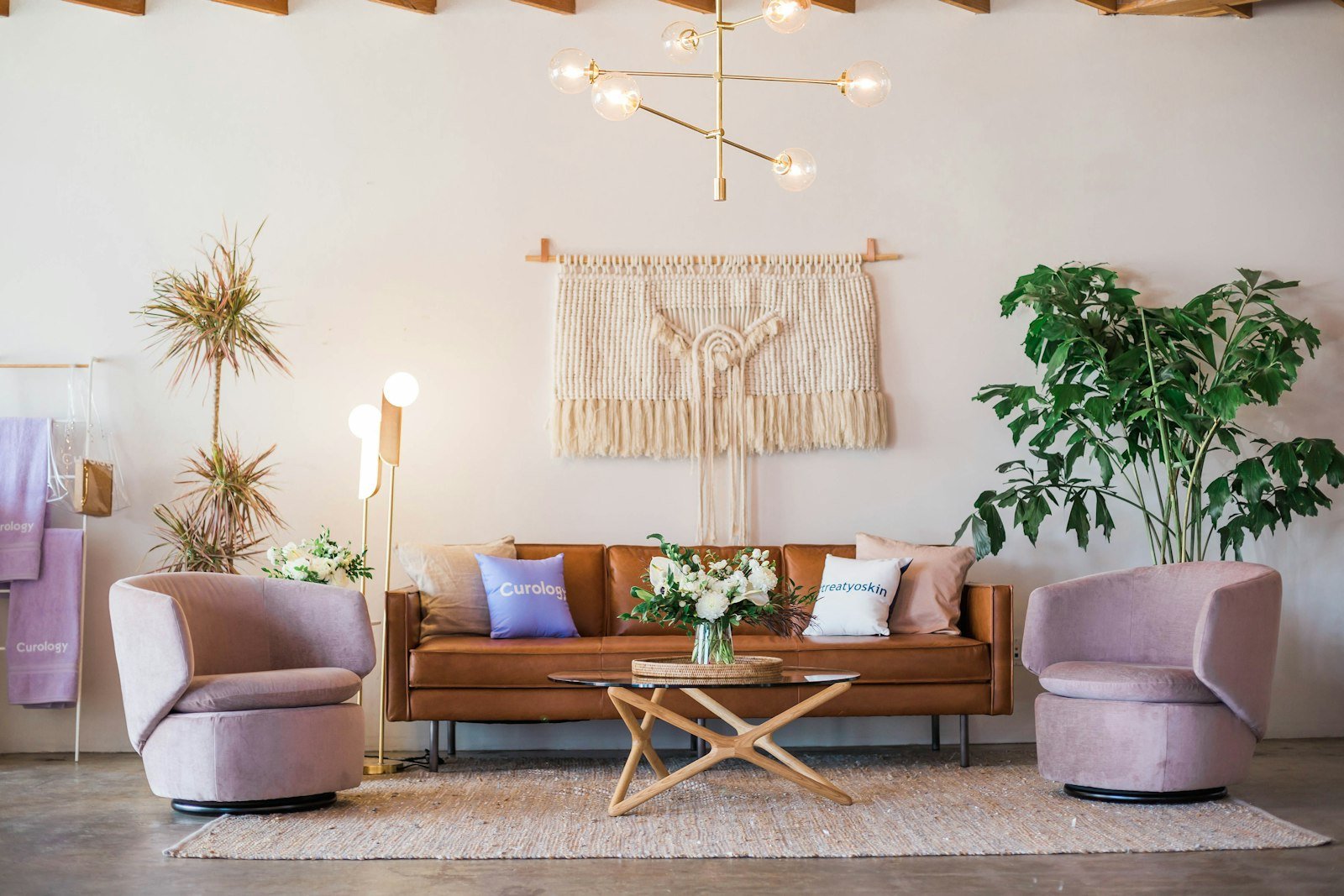
The brown coming back isn’t the magnolia-and-mahogany brown of a 1990s dining room. It’s warmer, dirtier and often has purple in it. Homes & Gardens noted that “purple-infused browns have been all the rage in 2026”, and a couple of the designers it asked for Pantone predictions went further. John Maloney McNamara of Coosa tipped Chocolate Plum, which he described as “a smoky brown-black with a violet undertone”. That’s the colour Farrow & Ball has been selling for years as Brinjal, and the one Little Greene sells as Purple Brown.
London designer Caroline Riddell put it simply: “Brown has warmth and depth.” She’s been pairing it with grass cloth and mohair, which is the clue to how this works in a real house. Brown on its own, on four flat walls, can look like the inside of a cardboard box. Brown with texture next to it – a wool rug, a linen curtain, a bit of rattan – looks rich. The texture does half the work.
There’s a reason this suits British homes better than the grey did. We get a lot of flat, blueish daylight from October to March, and grey under that light goes cold and slightly dead. Brown, clay and terracotta push back against it. In a north-facing front room the difference is obvious within a week, and it’s the same reason the limewash look caught on: warm, uneven walls forgive bad light.
And brown is easy to live with in a way that bolder trends aren’t.
Dark wood is the other half of this. Juliette Thomas of Juliettes Interiors told Sleek-chic that “dark wood is making a confident return”, and you can see it on the high street already – walnut-toned sideboards and smoked oak coffee tables are creeping back in where pale Scandi oak sat for a decade. If you’ve got a brown mid-century piece in the loft, now’s the time to get it down.
Green won the vote before Pantone even counted it
Pantone hasn’t announced its 2027 colour yet, but the people who spend their lives guessing it have mostly settled on green. Forbes asked 55 designers and colour experts what they expected, and 22 of them said a green – more than any other colour family. The shades they named ranged from Cress Green and Guacamole to a deep hunter green. Pantone’s last green was Greenery, back in 2017.
The paint brands are already there. Behr’s Grounded, Sherwin-Williams’ Celery, Benjamin Moore’s Webster Green and Dulux’s Soulful Sage are all greens of one sort or another, and they cover nearly the whole range from pale yellow-green to near-black forest. The one I’d watch is chartreuse. Chloe Barrow of Laura James called it “one of the more surprising colours to watch in interiors” for 2027, and Farrow & Ball’s Churlish Green is the obvious British example. It’s a sharp, slightly sour yellow-green that looks brilliant on a painted door or a lampshade and terrible across a whole room.
Here’s my problem with all of this, though: Pantone doesn’t matter to your house. Its colour of the year is a fashion and branding exercise first. You can’t walk into a shop and buy Pantone paint off the shelf, and its picks have a habit of being tied to what’s happening in clothing and products rather than what looks good on a plastered wall in Leeds. Cloud Dancer, its 2026 choice, was a soft off-white that told you nothing you didn’t already know. If you’re thinking of waiting until December to decide on your living room colour, don’t bother. The Dulux, Little Greene and Graham & Brown picks are far more useful, because you can buy them, test them and see them under British light.
The 2027 trends I’d actually spend money on
Colour gets the headlines, but the more interesting interior design trends for 2027 are about how rooms get used. A few stood out from the forecasts and from what I’ve seen in shops this autumn.
Layering. John Law of Woodhouse & Law expects layering to go much further next year – more rugs on rugs, more mixed fabrics, more objects on shelves. This is the cheapest trend to follow, because it mostly means using things you already own in a different way. A second rug, a throw, some books stacked sideways. It also works with any wall colour, including the grey you’ve already got.
The “analogue” room. Homes & Gardens has been tracking a rise in book nooks, record corners, games rooms and craft spaces – rooms, or corners of rooms, with no screen in them. Roisin Giese of Twelve Chairs Interiors says her clients are asking for “dumb” homes that are intuitive to live in, rather than smart homes full of hubs and apps. I like this one a lot. It costs almost nothing (a chair, a lamp, a shelf), it changes how a house feels in the evening, and it isn’t tied to a colour that’ll date.
Kitchens you can see into. Liv Taylor of Yellow London says people want to show off their pans and cookbooks rather than hide everything behind handleless doors. Open shelving, pantries with glass fronts, a rail for utensils. This follows on from the coloured cabinets we wrote about in this year’s kitchen trends, and it’s a cheap add-on to an existing kitchen – a run of open shelves from IKEA costs less than replacing one cupboard door.
Warmer floors. James Higgins of Online Carpets expects “a greater move towards warmer tones rather than the cold greys” in flooring. If you’ve got grey laminate, this is the one area where the new palette might clash. I wouldn’t rip it out, but a large warm-toned rug over it will do most of the job.
Conversation layouts. Sofas pulled away from walls, chairs facing each other, the TV no longer the centre of the room. Designers have been saying this for years, so I’m not sure 2027 is when it finally happens. But it pairs well with the analogue room idea, and moving furniture is free.
Colour drenching is the one I’d skip
Every 2027 forecast mentions colour drenching – painting walls, ceiling, skirting, doors and sometimes radiators all in the same colour. Homes & Gardens has been calling the latest version “hue-drenching”, where you use several close shades of one colour rather than exactly the same tin everywhere. It photographs beautifully. It looks great in a London townhouse with three-metre ceilings and sash windows on two sides.
In a typical British semi, I think it’s mostly a mistake. Drench a small, north-facing box room in Marle or Webster Green and you get a cave, and not a cosy one. You also lose the one easy way to make a low ceiling feel higher (keeping it pale), and you commit to a full room of a trend colour that you’ll want to change sooner than you think. The cost adds up too, because you’re buying gloss or eggshell for woodwork in the same shade, often from a premium brand.
But I’ll admit it works in two places: a downstairs loo, where the room is small enough that drama is the point, and a hallway with decent light. Anywhere else, paint the walls and leave the ceiling white.
The other trend I’d treat with suspicion is aubergine as an accent colour. Elena Navarro of Sparkly Maid Austin called it “the accent colour of 2027”. It’s lovely on a velvet cushion. On a kitchen island it’ll look very 2027 by about 2029.
What a 2027 refresh costs, from tester pot to a full room
You don’t need to redecorate to get the look. Here’s roughly how the spend breaks down at the time of writing, using normal retail prices rather than sale prices.
The cheapest step is tester pots. Most brands charge a few pounds each – Dulux’s are usually around three to four pounds at B&Q, while Farrow & Ball and Little Greene sit nearer five to six. Buy two or three shades, paint A4 sheets of lining paper rather than the wall, and move them round the room for a week. It’s a bit of a faff, but it’s the single best way to avoid an expensive mistake, and it’s especially important with browns and greens, which change more than most colours between morning and evening light.
Painting a standard living room (roughly four by four metres) usually needs two 2.5-litre tins for two coats. With Dulux, that’s in the region of £60 to £80. With Little Greene or Farrow & Ball, expect to pay well over £100 for the same area. Is the premium paint better? The colour depth is, a bit, in the deeper shades. In paler sage and celery tones, most people won’t see the difference, and I’d put the savings into a decent brush and roller.
If you don’t want to paint at all, the soft furnishings route works. A couple of brown or rust cushion covers, a wool throw in olive or moss, one dark wood side table. You can do that for under £150 across Dunelm, H&M Home and a charity shop, and it shifts a grey room into 2027 without touching the walls. And if you want one statement piece, a dark wood or rattan chair does more than any paint colour – though as we found with the sculptural accent chair trend, check you can actually sit in it before you buy.
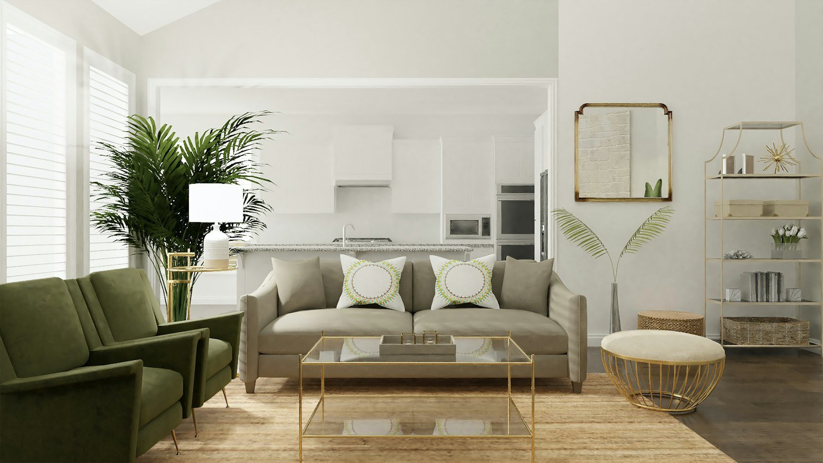
Why your grey sofa can stay
This is the point most trend pieces won’t make, so I will. If you bought a grey sofa in the last five years, keep it. Grey upholstery sits very happily against brown walls, sage walls and clay-pink walls – it reads as a neutral, not a statement, once the room around it’s warm. The grey that’s dated is grey on every surface at once: walls, carpet, sofa, curtains, the lot. Break that up and the sofa looks fine.
The same goes for white kitchens and bathrooms. Our look at bathroom trends this year found Britain moving away from all-white, but that doesn’t mean a white suite needs ripping out. Change the wall colour, the towels and the mirror, and a white bathroom looks deliberate again.
The broader shift behind interior design trends 2027 is towards rooms that look lived in, with older furniture, more books, warmer colours and less concern with everything matching. That’s good news for anyone on a budget, because it rewards keeping things rather than replacing them. It’s the same instinct behind the “collected, not bought” look we saw in this year’s Christmas decorating.
How to tell which bits will last? My rule is simple. A trend that changes how you use a room – a reading corner, open shelves, a sofa facing a chair – tends to stick. A trend that’s just a colour usually has five years at most, and the more specific the shade, the shorter the shelf life. Brown in general will be around for a while. Chocolate plum on every wall probably won’t.
Pantone will have its say in a fortnight, and I’d put money on some kind of green. But the more useful question is closer to home: which room in your house would you change first if you could only buy one tin of paint this winter?